This is why Audi logo has four interlocked rings
- Audi’s distinctive logo has a cool story behind it
- It was originally designed to symbolize the merging of four companies
- Audi, DKW, Horch, and Wanderer joined forces in the 1930s and became known as Auto Union AG
Published on Jul 04, 2024 at 2:46 AM (UTC+4)
by Claire Reid
Last updated on Jul 04, 2024 at 5:49 PM (UTC+4)
Edited by
Tom Wood
The distinctive Audi four-ringed logo has an interesting history behind it – as it symbolizes the merging of four companies.
As far as car branding goes, Audi is right up there with the best of them, isn’t it?
The four interlocking rings are immediately recognizable. So much so, that even those who know hardly anything about cars would likely still be able to name the company behind the badge.
READ MORE! Audi has launched its most powerful car ever with 912hp
Audi went for simplicity when it came to designing its logo
“A logo should be memorable and easily recognizable,” Audi states on its website.
And one of the key factors that make it almost instantly identifiable is its simplicity.
Erring away from flashy or over-the-top branding, the company opted for four understated interlocked rings. Classic and timeless.
However, while the branding might be simple, the story behind it is a little deeper.
Explaining the history behind its ring design on the Audi website, the car manufacturer says it was created to symbolize the merging of four automobile manufacturers based in the German state of Saxony: Audi, DKW, Horch, and Wanderer.
“The company emblem consisted of four interlocking rings, intended to symbolize the inseparable unity of the four founder companies,” it explains.
On June 29, 1932, the four companies became Auto Union AG, which was at the time the second-largest motor vehicle manufacturing group in Germany.
The logo has undergone some changes over the years
Although the four companies merged – to begin with, each brand retained its original name and was assigned a specific market segment within the group.
DKW was given motorcycles and small cars; Wanderer had midsize cars; Audi took care of cars in the deluxe midsize segment; and Horch headed up luxury cars at the top end of the market.
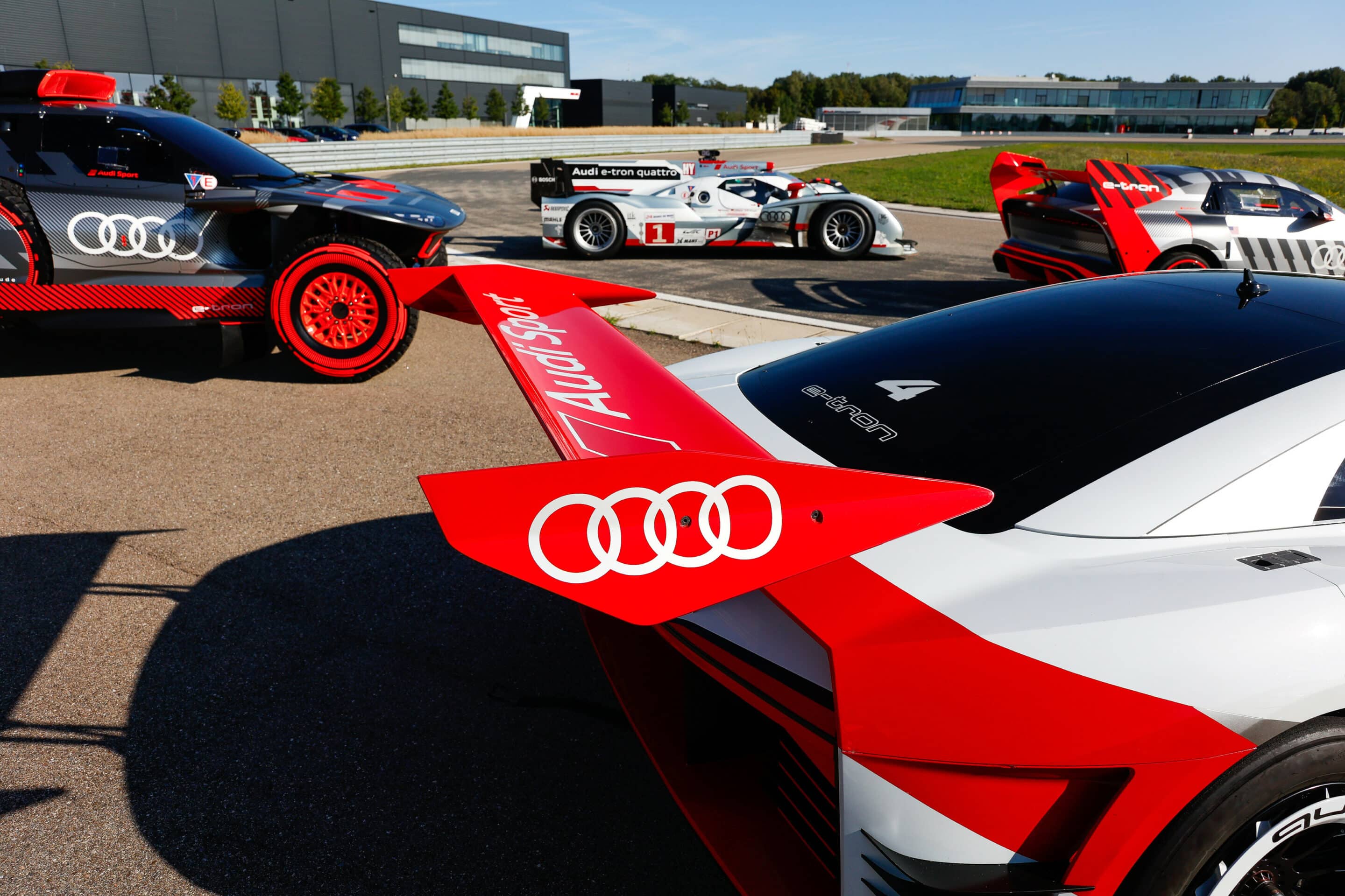
This meant that originally, the newly designed Auto Union AG ringed logo only appeared on Auto Union racing cars while cars made by each of the member companies continued to use their own.
While the logo has retained its four ring design over the years, it has undergone a few changes.
In the 90s, designers were tasked with giving the rings a three-dimensional look.
More recently, in 2016, designers realized that the logo needed to look as good online as it did on their cars so they decided to make it two-dimensional once again.
And if that’s not quite enough automotive history for you, then check out what AMG actually stands for in Mercedes-AMG.
DISCOVER SBX CARS: The global premium car auction platform powered by Supercar Blondie

Claire Reid is a journalist who hails from the UK but is now living in New Zealand. She began her career after graduating with a degree in Journalism from Liverpool John Moore’s University and has more than a decade of experience, writing for both local newspapers and national news sites. Across her career she's covered a wide variety of topics, including celebrity, cryptocurrency, politics, true crime and just about everything in between.