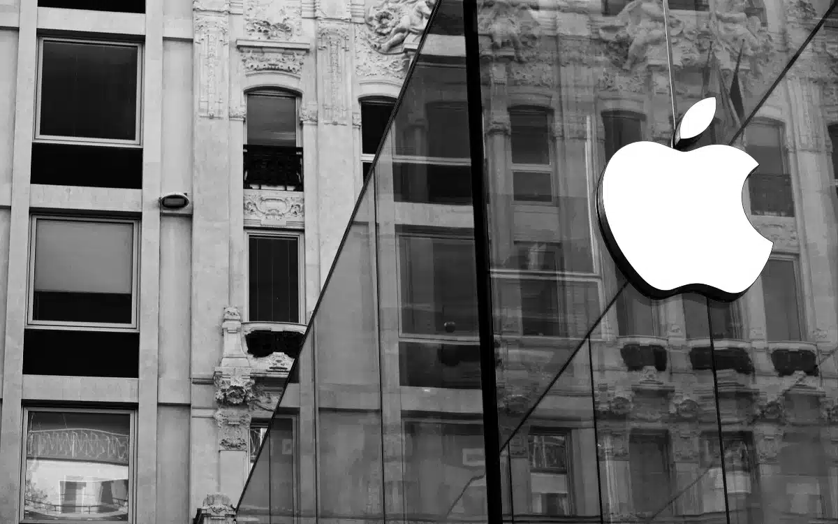
The reason the Apple logo has a bite taken out of it is incredible
- The Apple logo is instantly recognizable.
- But have you ever wondered about the missing chunk?
- One tech content creator has broken down the facts surrounding the fiction.
Published on Feb 27, 2024 at 3:26 PM (UTC+4)
by Amelia Jean Hershman-Jones
Last updated on Mar 07, 2024 at 6:02 PM (UTC+4)
Edited by
Alessandro Renesis
The Apple logo is instantly recognizable – but you might not realize why the iconic fruit has a bite taken out of its side.
But one content creator has finally explained the reason.
And it might just surprise you.
READ MORE! Apple supposedly testing revolutionary new camera for iPhone 16
The Apple logo is simply iconic – with the original voice of Siri a close second – and it’s present and prominent on almost every product they produce.
But fans have long wondered: why the missing chunk?
Rumors swirled that it was a play on words on the words “bite”and “byte” (a unit of memory).
But the story, dating way back to the brand’s humble beginnings in 1977 suggest that this isn’t, in fact, the case.
Per the video by Apple Explained, Steve Jobs turned to an ad agency to design a simple logo.
The brand’s original logo of Sir Isaac Newton seated under an apple tree was far too complicated to put on the side of a computer.
Enter corporate logo graphic designer, Rob Janoff with a simple instruction from Jobs: “Don’t make it cute.”
Unlike brands including IBM and Hewlett Packard, the decision was made to focus on an image rather than typography.
He created a simple silhouette of an apple with a leaf on top.
So far so simple.
The problem?
Apple is not the only round fruit with leaves and, with no context on its size, many confused it for a cherry.
The solution was a bite out of the side, which consumer groups agreed made it more easily identifiable as an apple, without overcomplicating it.
While no longer the case today, colored stripes were also added.
This represented that the computer could display color images – something no other brand had done.
Ever the enthusiast, Jobs simple responded: “Okay, that’s nice.”

And history was made as it became the official logo of the company.
However, Apple have recently taken a more subtle marketing approach and doesn’t show its logo on its latest releases such as its AirPods.
When asked about the “bite”/”byte” rumours, Janoff had to admit the wordplay wasn’t intentional: “I’m afraid it didn’t have a thing to do with it,” he said.
“It’s just a small, happy coincidence.”
So now you know.
In other Apple news, an incredible improvement for all iPhone 15 owners has just been confirmed.
What’s more, Apple have debunked one common iPhone myth with official warning – step away from your pantry.
DISCOVER SBX CARS: The global premium car auction platform powered by Supercar Blondie

All Supercar Blondie contributors undergo editorial review and fact-checking to ensure accuracy and authority in automotive journalism. After gaining her BA Hons in French and English at the University of Nottingham, Amelia embarked on a vocational diploma from the National Council for the Training of Journalists (NCTJ). This led to numerous opportunities, from interning at Vogue to being on the small team that launched Women’s Health magazine in the UK, which was named the PPA Consumer magazine of the year for three years running. As Health, Beauty and Fitness editor, Amelia personally received a Johnson & Johnson Award and was shortlisted for both PPA and BSME titles. Since then, Amelia has created content for numerous titles and brands, including the Telegraph, 111 Skin, Waitrose, Red magazine, Stylist, and Elle, as well as being Head of Content at Vitality and Editor in Chief at INLondon magazine. “My superpower is translating technical jargon about the mechanical workings of a supercar into a relatable story you’ll want to share with your friends after you’ve read it.” After joining the SB Media family as a senior journalist in September of 2023, Amelia’s role has evolved to see her heading up the SEO output of the editorial team. From researching the most ‘Google-able’ key terms to producing evergreen content - it’s been a time of hard work, growth, and success for the editorial team and the Supercar Blondie website. “I like to think of myself as a ‘method journalist’. In other words: I live and breathe whatever I am writing about. When writing about fitness, I trained as a personal trainer, and as a beauty editor, I completed an ‘expert’ in scent diploma with the Fragrance Foundation. “During my tenure at Supercar Blondie, however, I did something I never thought possible: I passed my driving test at the age of 36. One day I’d love to train as a mechanic to better understand what happens under the hood, too. “My sweet spot is providing readers with a ‘takeaway’ (read: something new they didn’t know before) after reading every one of my stories. While I don’t claim to be an expert in the automotive world, I know the experts and bodies in the field to rely on to provide our readers with an informative and thought-provoking story every time they visit the site.”