Intense debate over what Toyota's logo means leads to people finding out its actual 'hidden' meaning
- This TikToker had a theory behind Toyota’s iconic logo
- His comments sparked a bug debate in the comments section
- But Toyota Magazine has an official explanation
Published on Apr 02, 2025 at 11:15 PM (UTC+4)
by Ben Thompson
Last updated on Apr 03, 2025 at 12:06 PM (UTC+4)
Edited by
Tom Wood
Intense debate over the meaning behind Toyota’s logo had led people to realizing its ‘hidden’ meaning.
Logos are made to be distinctive, iconic, and memorable.
Nobody said their meaning had to be immediately apparent to everyone who laid eyes upon it.
Toyota’s emblem has been causing quite a bit of debate online, but its true symbolism has passed most people by… until now.
EXPLORE SBX CARS – Supercar auctions starting soon powered by Supercar Blondie
The meaning of Toyota’s logo has caused a big stir online
This isn’t the first time that the logo of a car brand has had people talking online.
You may recall that Jaguar caused a big stir last year when it launched a new logo for its ‘electric era’.

Mazda also unveiled a new logo last year, following in a tradition of updating its branding.
Other brands have had logos with mysterious meanings, including Ferrari’s prancing horse and Audi’s interlocking rings.
And now it was Toyota’s turn to go under the magnifying glass.
You’ve undoubtedly seen its logo somewhere.
Maybe you’re a pro and you can identify it from the back of a car without a moment’s hesitation.
Or perhaps you’ve spent a ton of time acing ‘guess the car logo’ quizzes online.

But at any rate, you likely know what it looks like.
However, have you ever given any thought to why it looks the way it does? Not likely.
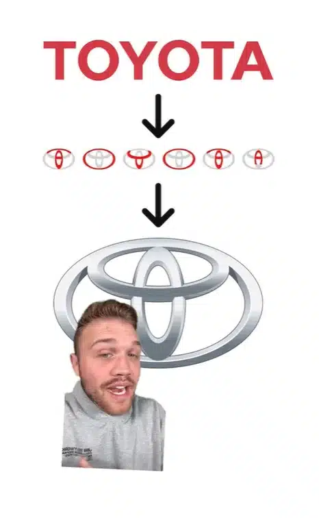
A TikTok channel called therealoshow suggested that it contained a representation of every letter in the company’s name.
Suffice to say, that has sparked some debate.

Is this TikToker’s interpretation valid?
The comments section was filled with differing opinions about Toyota’s logo.
“The Toyota logo is a thread passed through the eye of a needle because they started out making industrial sewing machines,” one viewer said.
This was echoed in another comment: “You’re wrong about Toyota emblem. They were originally a sewing machine company, and that is a piece of thread going through the eye of a needle.”
Another commented: “I don’t know. To me, Toyota looked like a circle around the world.”
So, what is the truth?

Toyota Magazine itself provided the answer.
It might surprise you to learn that this design is a relatively new development in the company’s history, as it was introduced in 1989 to mark the company’s 50th anniversary.
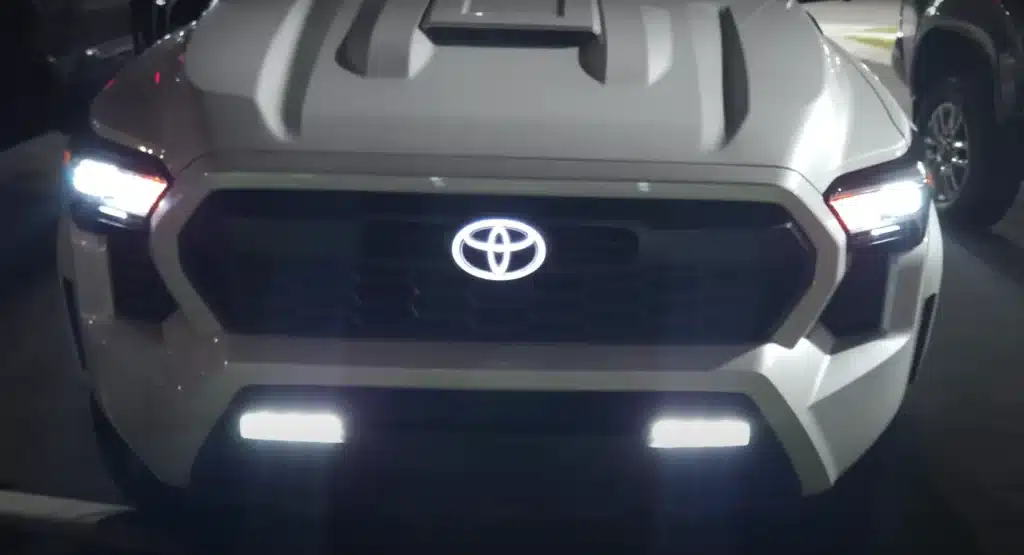
Here’s what the magazine had to say: “The three ovals in the Toyota logo are linked in a horizontally symmetrical layout – so it is recognisable both head-on and when seen in a rear-view mirror.
“The inner ovals symbolise the heart of the customer and the heart of the company, overlapping to represent a mutually beneficial relationship and trust between the two, as well as forming a ‘T’ shape for Toyota. The outer oval one signifies the world embracing Toyota.
“Each oval is drawn with different stroke thicknesses, pointing to Japanese calligraphy art and culture.
“The space in the background within the logo is meant to exhibit the ‘infinite values’ which Toyota stands for. These are: superb quality, value beyond expectation, the joy of driving, innovation, and integrity in safety, the environment and social responsibility.”
So there you have it.
Bet you never thought a T in a circle could be so deep, huh?
DISCOVER SBX CARS: The global premium car auction platform powered by Supercar Blondie
Following stints at LadBible, The Sun, The New York Post, and the Daily Mail, Ben joined the team full-time in February 2025. In his role as Senior Content Writer, his sparkling copy, the ability to sniff out a good story at 100 paces, and a GSOH quickly led to him becoming an integral and invaluable member of the writing staff.


