Little-known detail in the Ford logo is leaving people baffled they missed it
- The Ford logo is one of the most iconic pieces of branding in the world
- The logo is inspired by the handwriting of Henry Ford
- However, one detail in the logo has left people on the internet baffled
Published on Feb 25, 2025 at 1:25 PM (UTC+4)
by Keelin McNamara
Last updated on Feb 26, 2025 at 11:54 AM (UTC+4)
Edited by
Keelin McNamara
The Ford logo is one of the most famous logos in the world.
The iconic blue oval with the flowing “Ford” placed in the centre represents motoring excellence.
However, there has been a lot of intrigue recently regarding the logo.
Today, we’re going to take a look for ourselves.
DISCOVER SBX CARS: The global premium car auction platform powered by Supercar Blondie
Ford origin story: Henry builds an automotive giant
Today, you know Ford as the second largest automotive manufacturer in the United States, as well as being the sixth-largest in the world.
However, at the turn of the twentieth century, the picture was very different.
Henry Ford was the son of an Irish father and a mother who was a Michigan native.
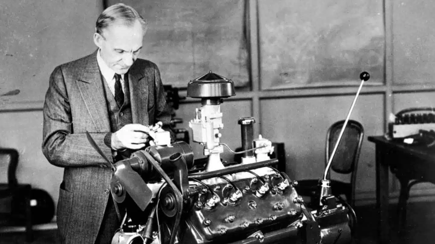
Ford build his first car in 1892, and had three built in his workshop by 1896.
Ford helped establish the now-famous Ford Motor Company on June 16th, 1903.
In 1908, Ford created the now-legendary Model T.
By the end of 1927, Ford sold more than 15,000,000 units of the Model T, and at one point, over half of the cars in the United States were a Ford Model T.
Logo controversy: where is the intrigue coming from?
The early days of Henry Ford, of course, saw the Ford Motor Company go from strength to strength.
Now, they seem permanently positioned as one of the giants of the global automotive industry.
However, there has been a lot of intrigue recently surrounding the logo.
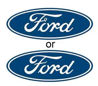
One TikTok user, Monica Turner, released a video on TikTok pointing out her confusion at the Ford logo.
As she points out, there are two Ford logos.
One has the famous curl on the letter “F”, and the other one does not.
@monicasopenhouse Mandela Effect- The Ford Logo! I think they BOTH Look wrong, 🤣😂! #MonicasOpenHouse #FYP #mandelaeffect #FordLogo #strangebuttrue #TimeShift #Cern #WeirdStuff #Over30 #Over40 #Over50 #GenX #ConspiracyTheory #tinfoilhat ♬ original sound – Monica Turner
“This one’s weird because the more I look at it, the more I think they’re both wrong,” Monica says.
Ford logo origin story
In 1909, six years after the Ford Motor Company was founded, they adopted the logo, and used Henry Ford’s handwriting as direct inspiration.
The website Car Logos provides some excellent context on the logo.
“The font’s origins date back to Childe Harold Wills, a Ford Motor Company engineer and designer who worked closely with Henry Ford. Wills studied Ford’s signature and adapted it to create a distinctive font for the company’s logo,” they said.
Whatever the reason, the logo remains one of the most iconic in the world, and seems sure to remain so for quite some time.