McLaren changes its logo to pay a special homage to its founder's racing heritage
Published on Sep 23, 2026 at 6:04 AM (UTC-4)
by Ben Thompson
Last updated on Sep 23, 2026 at 10:20 AM (UTC-4)
Edited by
Kate Bain
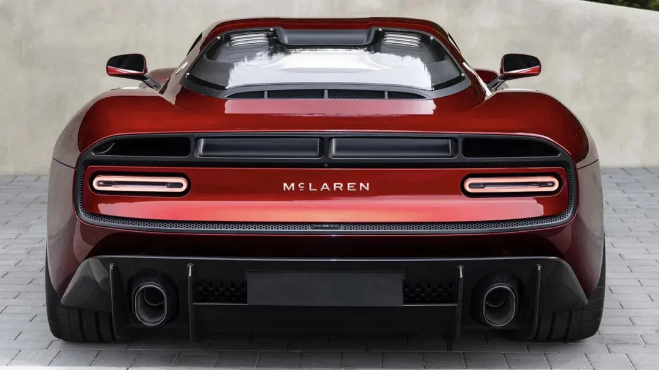

McLaren has unveiled its new logo and it pays homage to the founder’s racing heritage.
The luxury automotive manufacturer is the latest company to give its brand image a makeover.
At first glance, this new logo might not appear to be anything too revolutionary.
But behind the seeming simplicity is a backstory that extends all the way to the founder’s childhood.
McLaren isn’t the only car company to have a rebrand in recent years
In the fast moving world of business, companies can seldom afford to remain stationary for too long.
So every now and then, a rebrand is in order to keep things interesting.
Plenty of companies have done this over the years – one need only look at Pepsi’s Concorde makeover to see how drastic things can get.
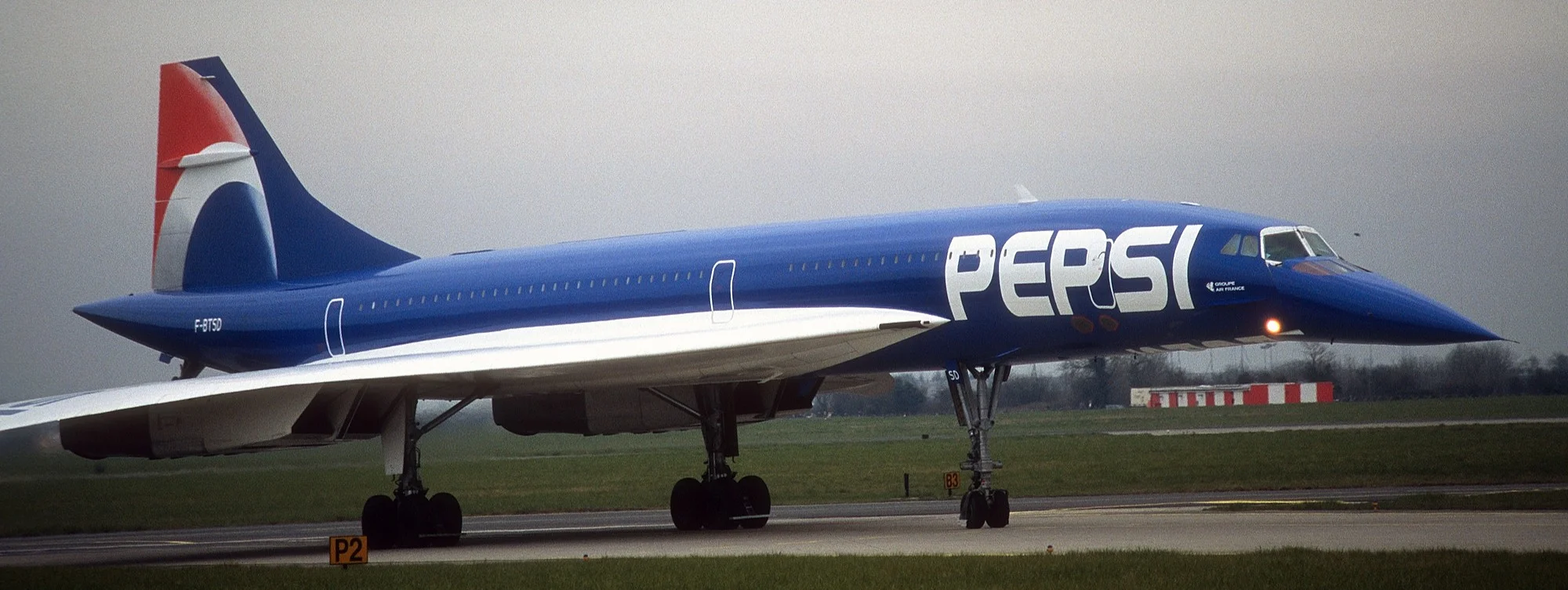
In the world of cars, it’s seldom as expensive as repainting an entire plane.
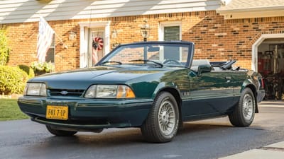
For Range Rover, it was a new logo that signaled a turning point, while Ford went the Taylor Swift route by deleting all of its Instagram posts.
Admittedly, some rebrands are less well received than others.
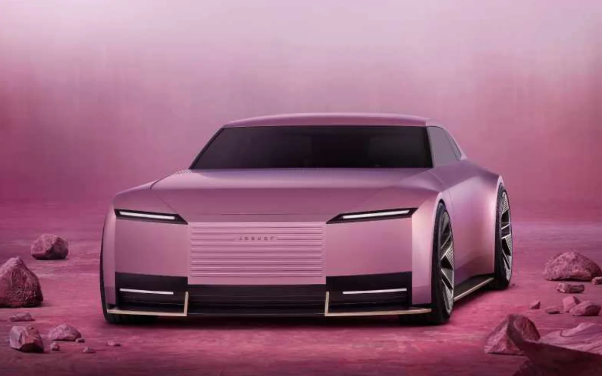
One need only recall Jaguar’s polarizing rebrand for the Type 00 to see how controversial things can get.
McLaren has taken a markedly less contentious approach with this brand refresh.
But while it won’t be causing social media rows, it’s still worth examining closely.
Related


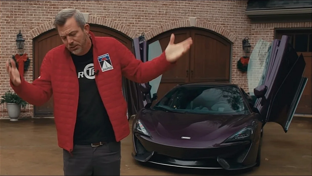
The backstory behind McLaren’s new logo
On the face of it, some might suggest that this new logo is not all that different from what came before it.
It looks very clean and crisp, but it is still the ‘McLaren’ brand name loud and proud.
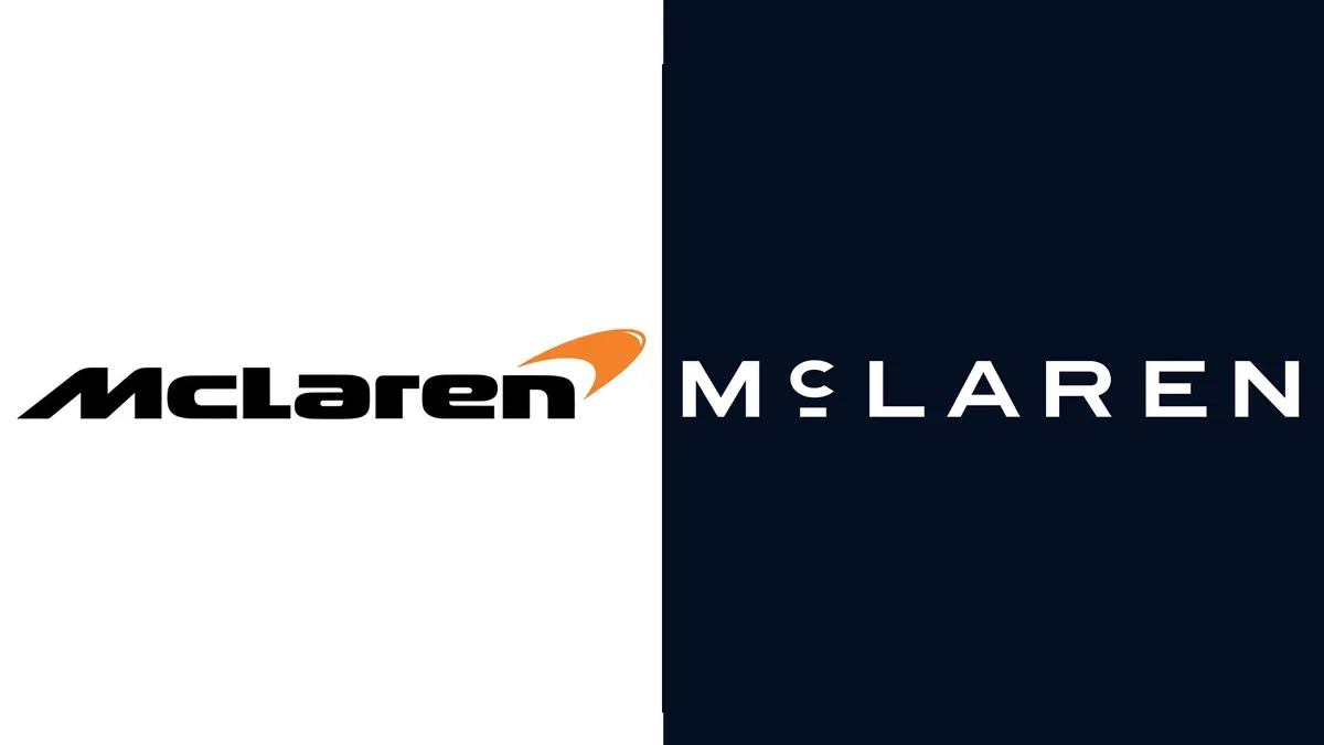
Top Gear reported that the logo will ‘dominate’ and be adopted by both the automotive and racing branches of the business.
It’s intended to present a ‘clearer and more unified expression of McLaren’, opening up an era with a ‘renewed focus on Bruce McLaren’s story’.
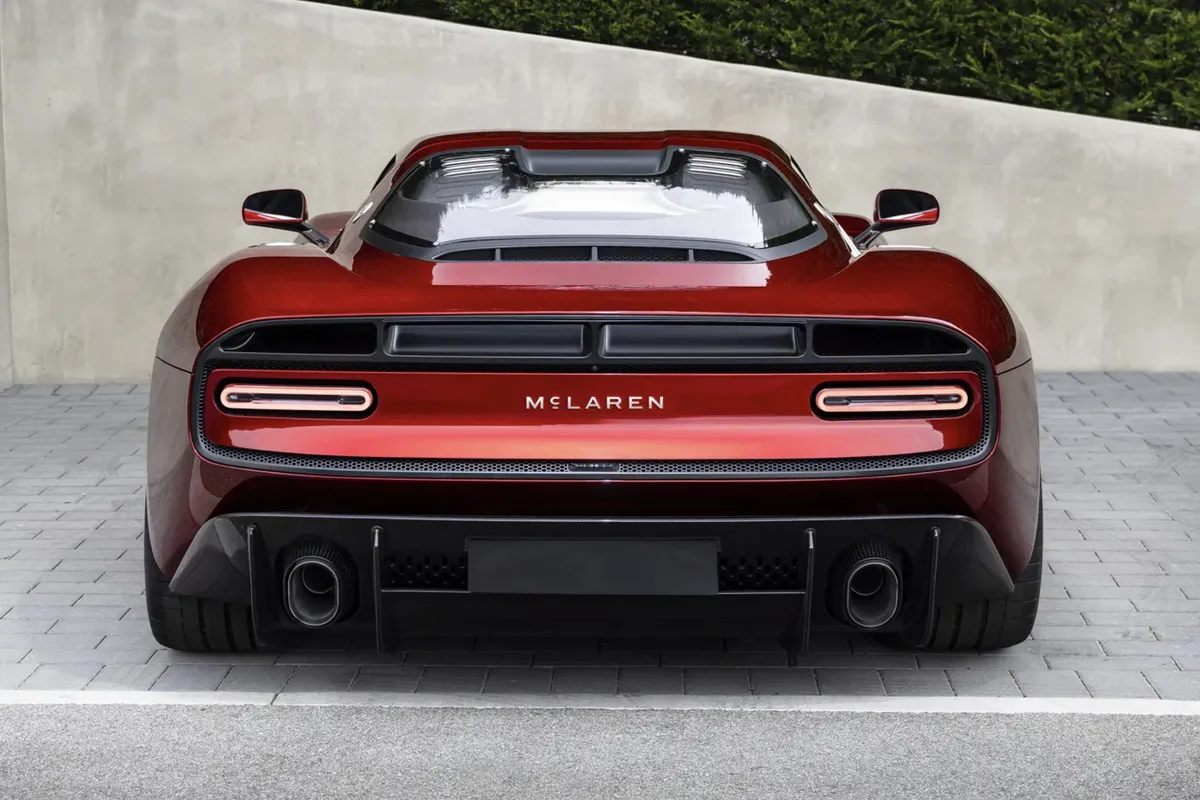
What’s meant by this?
Well, the new logo takes its inspiration from the family service station that McLaren’s parents ran in Remuera, Auckland way back in the 1920s.
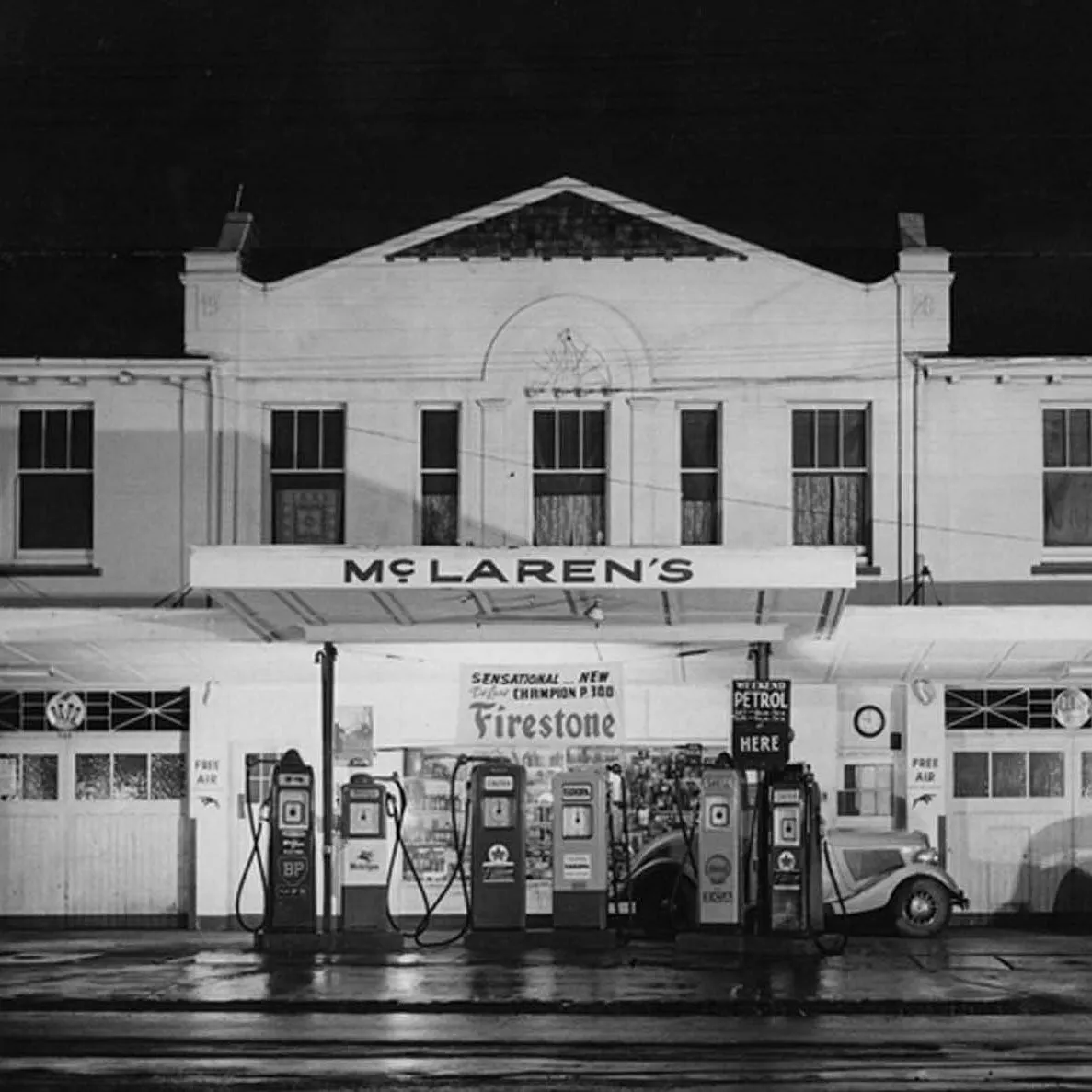
It was here that he built his first winning race car.
So it’s obviously a place of great significance for the brand as a whole.
Even the lowercase ‘c’ in McLaren carries some significance.
As noted by CreativeBloq, this lends the brand a sense of luxury, in line with a lot of high-end fashion brands.
“It’s a reflection of the journey we are on as a company,” David Woodhouse, the chief creative officer at McLaren Automotive, said.

“It marks the beginning of a new chapter for McLaren, giving a physical expression to the ambition, creativity and forward momentum that is shaping our future.”
Will the new logo go down well with the McLaren fans? We’ll have to wait and see.
Ben joined Supercar Blondie in February 2025 after being published by international organizations including LADbible, The Sun, the New York Post, and the Daily Mail. He covers supercars, rare and collectible vehicles, aviation, luxury assets, and the fascinating people behind them. His reporting has explored everything from seven-figure supercars and historic Ferrari collections to unusual aircraft adventures and extraordinary automotive discoveries from around the world. Ben has also gained first-hand insight into vehicle craftsmanship and customization, including visiting specialist workshops to see bespoke vehicles up close.