The Apple logo is instantly recognizable – but you might not realize why the iconic fruit has a bite taken out of its side.
But one content creator has finally explained the reason.
And it might just surprise you.

READ MORE! Apple supposedly testing revolutionary new camera for iPhone 16
The Apple logo is simply iconic – with the original voice of Siri a close second – and it’s present and prominent on almost every product they produce.
But fans have long wondered: why the missing chunk?
Rumors swirled that it was a play on words on the words “bite”and “byte” (a unit of memory).
But the story, dating way back to the brand’s humble beginnings in 1977 suggest that this isn’t, in fact, the case.
Per the video by Apple Explained, Steve Jobs turned to an ad agency to design a simple logo.


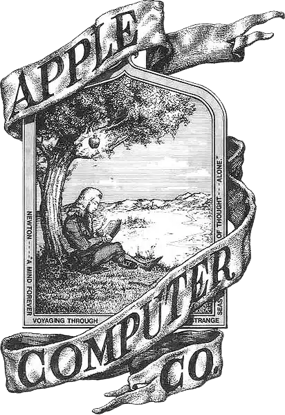
The brand’s original logo of Sir Isaac Newton seated under an apple tree was far too complicated to put on the side of a computer.
Enter corporate logo graphic designer, Rob Janoff with a simple instruction from Jobs: “Don’t make it cute.”
Unlike brands including IBM and Hewlett Packard, the decision was made to focus on an image rather than typography.
He created a simple silhouette of an apple with a leaf on top.
So far so simple.
The problem?


Apple is not the only round fruit with leaves and, with no context on its size, many confused it for a cherry.
The solution was a bite out of the side, which consumer groups agreed made it more easily identifiable as an apple, without overcomplicating it.
While no longer the case today, colored stripes were also added.
This represented that the computer could display color images – something no other brand had done.
Ever the enthusiast, Jobs simple responded: “Okay, that’s nice.”
And history was made as it became the official logo of the company.
However, Apple have recently taken a more subtle marketing approach and doesn’t show its logo on its latest releases such as its AirPods.
When asked about the “bite”/”byte” rumours, Janoff had to admit the wordplay wasn’t intentional: “I’m afraid it didn’t have a thing to do with it,” he said.
“It’s just a small, happy coincidence.”
So now you know.
In other Apple news, an incredible improvement for all iPhone 15 owners has just been confirmed.
What’s more, Apple have debunked one common iPhone myth with official warning – step away from your pantry.


