People are only just realizing the hidden meaning inside the Toyota logo
Published on Dec 30, 2025 at 4:05 PM (UTC+4)
by Keelin McNamara
Last updated on Dec 30, 2025 at 4:05 PM (UTC+4)
Edited by
Keelin McNamara
The Toyota logo is one of the most recognizable pieces of branding in the entire car world – but did you know that it actually has a hidden meaning?
The true meaning behind the Toyota logo has been revealed.
But it might very well surprise you to learn what it actually means.
Plus, you might be shocked to know the brand was almost called something entirely different.
DISCOVER SBX CARS: The global premium car auction platform powered by Supercar Blondie
Origin story of the legendary marque
Toyota’s branding is one with a long and storied history.
Interestingly, the world’s largest automaker did not actually start out as a car company.
The Toyota Automatic Loom Works (Toyoda Industries Corporation) was founded by Kiichiro Toyoda on November 18th, 1926.
It was Kiichiro’s son, Sakichi, who would establish an automotive division.
This historic act took place on September 1, 1933.
April 1936 saw the release of Toyota’s first-ever passenger car, the Model AA.
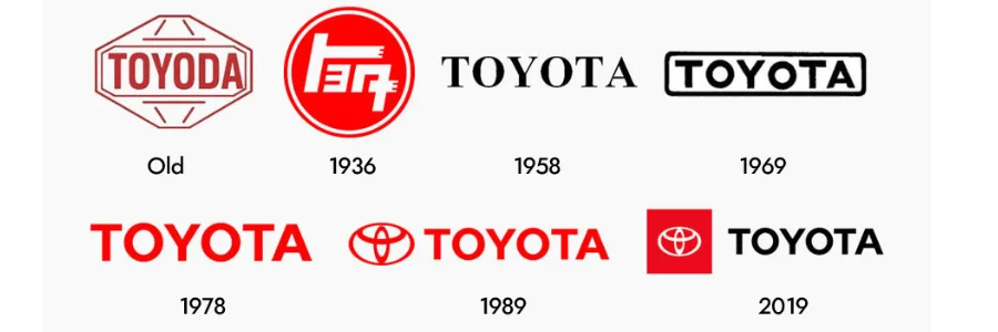
Now, you might be wondering at this point why the company is actually called ‘Toyota’ instead of ‘Toyoda’.
Well, it turns out that there is actually an interesting reason for that.

Rizaburo Toyoda married into the Toyoda family, and he preferred the term ‘Toyota’.
The reason he preferred that name was for a few simple reasons.
For one thing, it took eight brush strokes (a lucky number) to write in Japanese.
Another key reason for the change was that ‘Toyoda’ translates to “fertile rice paddies”.
Changing the name meant changing the direction of the brand from being associated with farming.
On August 28, 1937, the Toyota Motor Company Ltd was born.
What’s in a Toyota logo? Quite a lot, actually
So, how did the Toyota brand manage to land on such an iconic logo?
The current Toyota logo that we all know and love actually exists in order to pay homage.
It was introduced back in 1989 to mark the brand’s 50th anniversary.
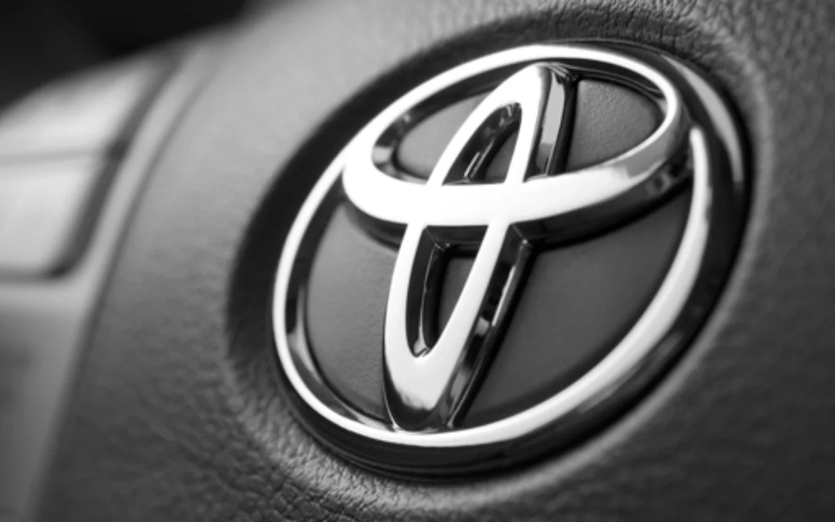
But the logo with three overlapping ovals has a much deeper meaning than you might realise.
The two inner ovals represent the heart of the customer and the heart of the company.
This overlap is meant to display trust, respect, and the relationship between the two.
Posts from the motorbuzz
community on Reddit
Of course, there is then the outer oval that wraps around them both.
This represents the brand’s global, ambitious view of the world beyond Japan.
When you trace the shapes together, they also just so happen to spell the letter ‘T’.
It’s such a subtle addition that it is almost impossible to spot unless it is pointed out.
But it perfectly represents a company that prides itself on quality and craftsmanship.


