People stunned by surprising reason Apple logo has a bite taken out of it
Published on Feb 17, 2026 at 2:24 PM (UTC+4)
by Daisy Edwards
Last updated on Feb 17, 2026 at 9:37 PM (UTC+4)
Edited by
Emma Matthews
The internet has found itself stunned by the surprising reason the Apple logo has a bite taken out of it, as the simple truth goes viral online.
The iconic Apple emblem has been stamped on everything from iPhones to MacBooks for decades.
But that tiny missing chunk has sparked endless conspiracy theories over the years.
Now, the real explanation is leaving fans shocked at how straightforward it actually is.
EXPLORE SBX CARS – Supercar auctions starting soon powered by Supercar Blondie
Who took a bite out of the Apple logo?
Everyone knows the Apple logo, it’s on all your gadgets like iPhones, MacBooks, and iPods, but it’s clear that someone – or something – has decided to take a bite out of it.
But the famous bite was never meant to be mysterious.
When graphic designer Rob Janoff created the logo in 1977, he wanted a clean and instantly recognizable silhouette.
Adding the bite made the fruit unmistakably an apple, especially when the logo was displayed in small sizes, because without it, the shape could easily have been confused with a cherry or another round fruit.

It was a practical design choice that ensured clarity across packaging, advertising, Apple stores, and products.
The detail also helped give the logo scale, so viewers could immediately understand the object they were looking at.
There is a popular belief that the bite was added as a nod to the word ‘byte,’ the computing term.
While the pun is undeniably clever, Janoff has explained that it was simply a happy coincidence rather than the driving idea behind the design.
Click the star icon next to supercarblondie.com in Google Search to stay ahead of the curve on the latest and greatest supercars, hypercars, and ground-breaking technology
The internet rumor mill
Because Apple became one of the biggest tech brands on the planet, theories around the logo quickly took on a life of their own.
Some believed it was a tribute to computing pioneer Alan Turing.
Others were convinced it symbolized the biblical fruit of knowledge, and both ideas spread widely online, adding to the mystique surrounding the brand.

In reality, the truth is far less dramatic: the bite exists purely to make the apple look like an apple.
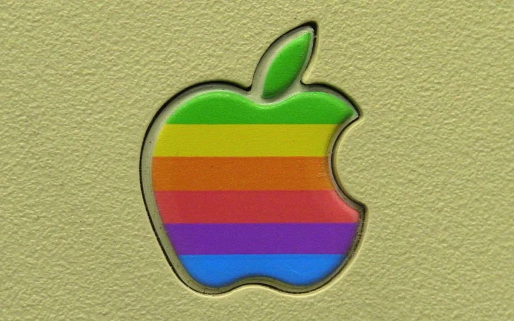
The original version of the logo even featured rainbow stripes to highlight the Apple II’s ability to display color graphics, which was a major breakthrough at the time.
Sometimes, the most iconic designs are not built on hidden meanings or secret tributes.
In this case, it turns out an apple is just an apple – no drama.
DISCOVER SBX CARS: The global premium car auction platform powered by Supercar Blondie


